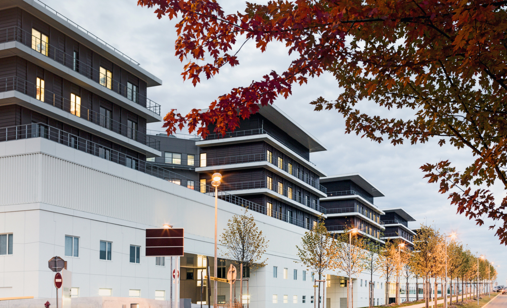
Gonesse Hospital
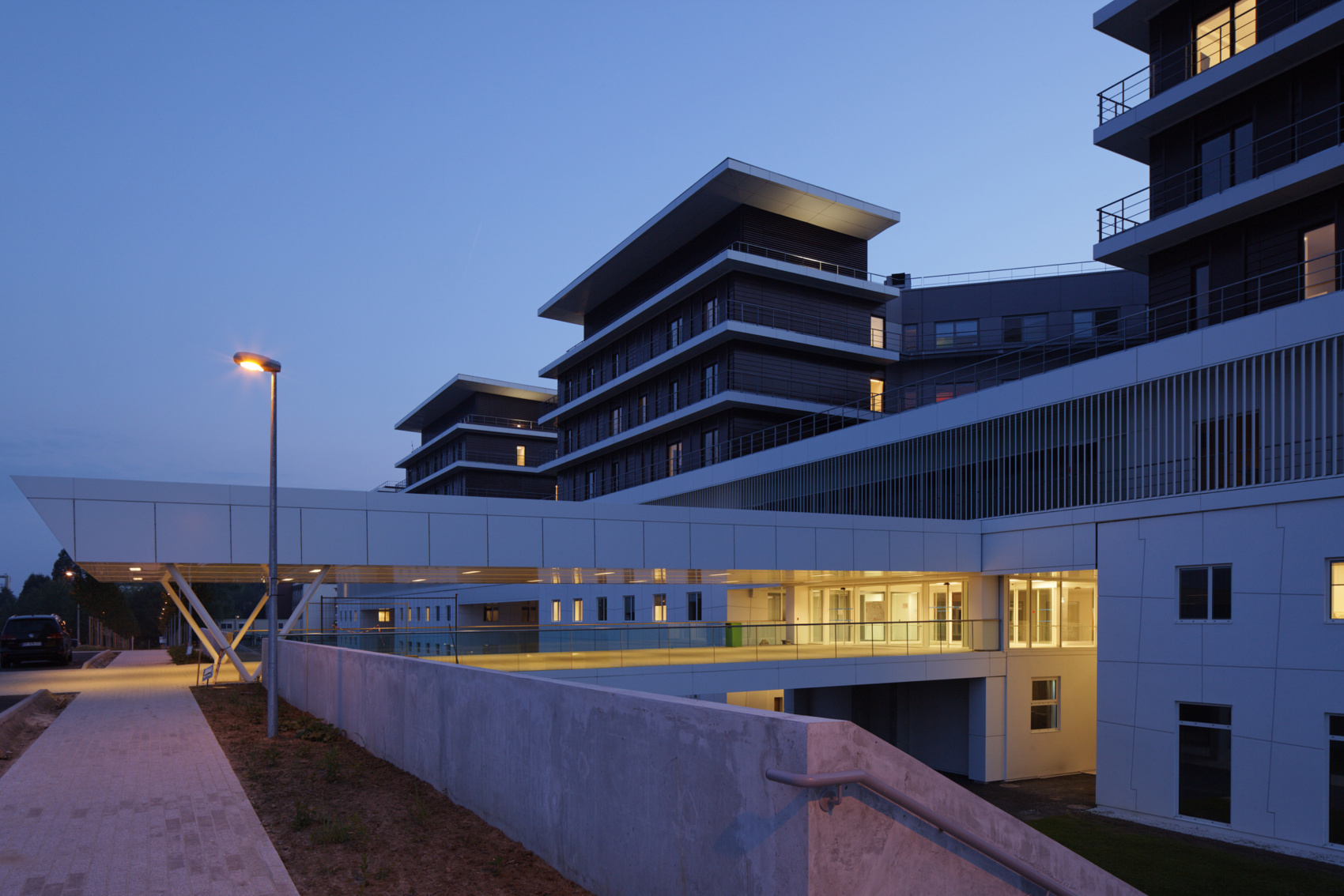
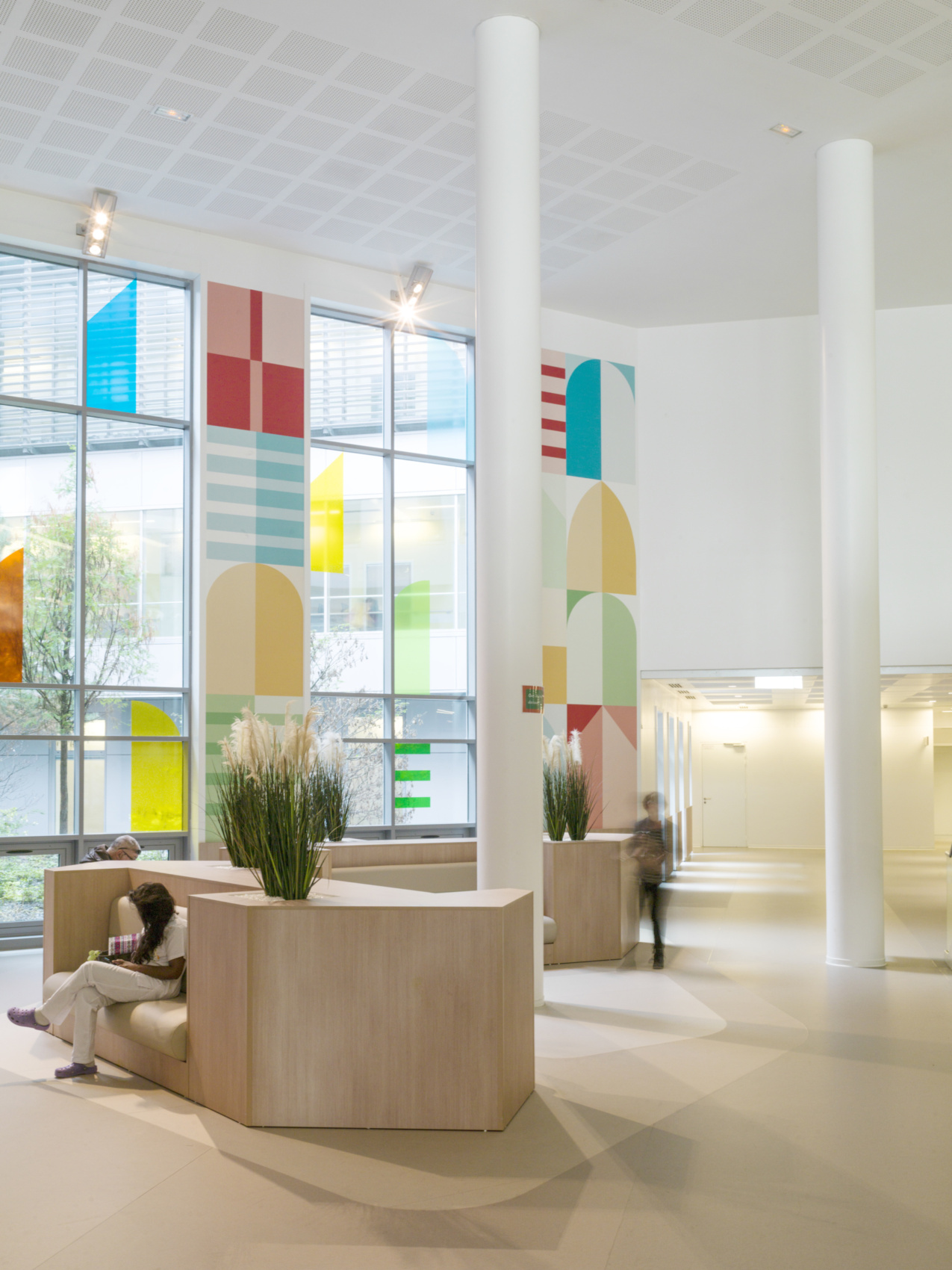
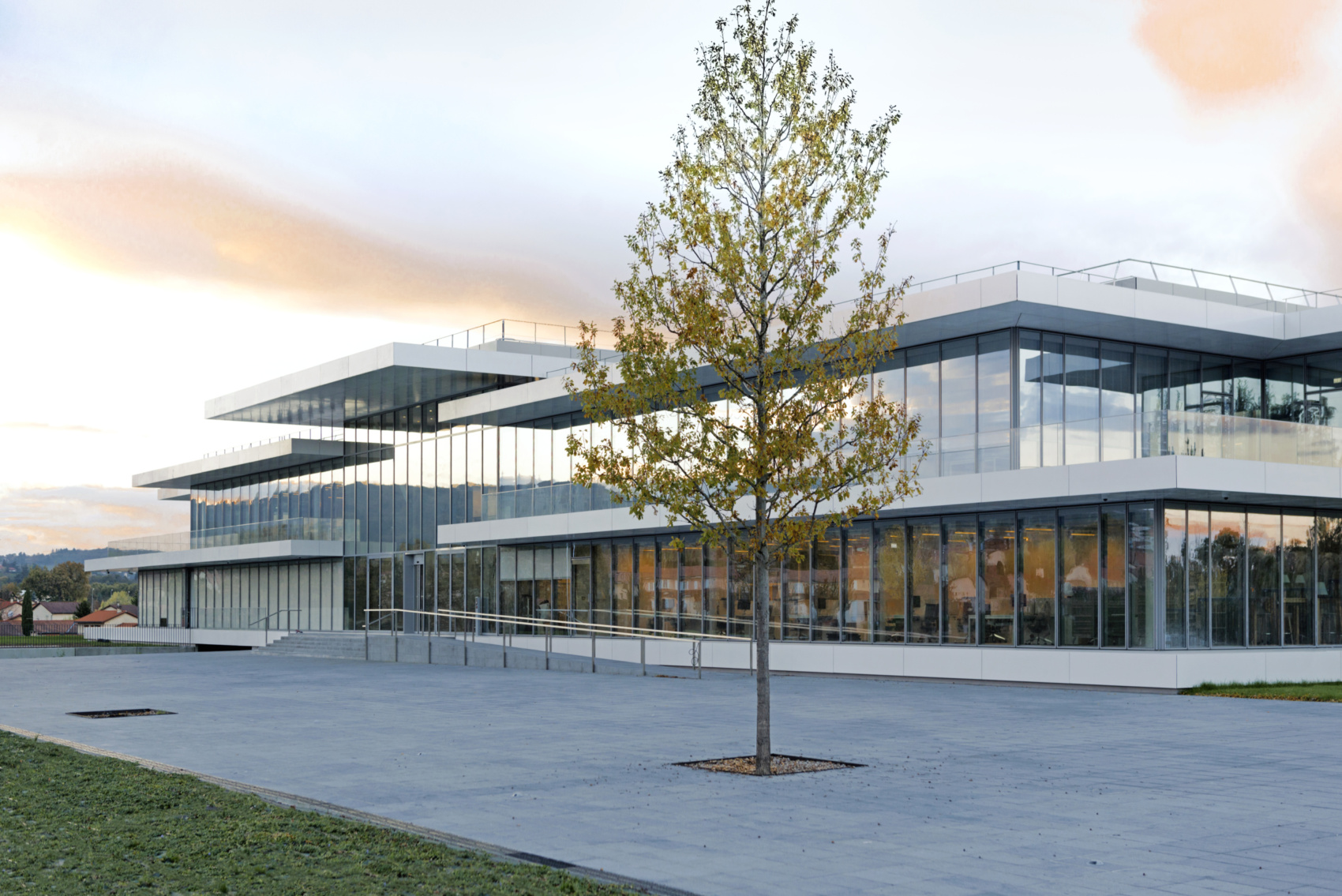
Everyone, whether general public or hospital staff, finds their way in this calm and secure environment. The main day-to-day access to the building is from a vast forecourt, attached to the central walkway. Previously impenetrable and unchanging, the new hospital now strives for openness and adaptation over time. Inspired by the industrial work-in-progress, the original typology proposed places it at the leading edge of medical progress.
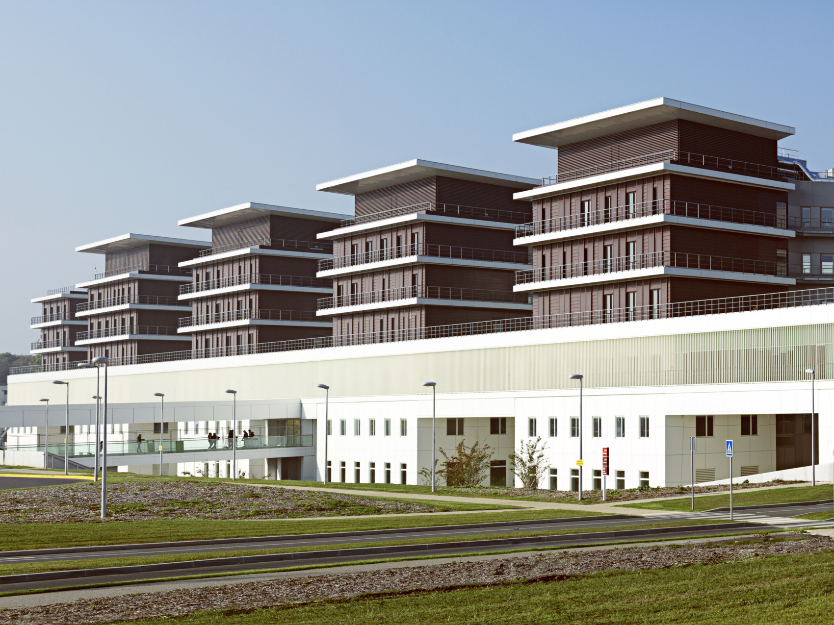
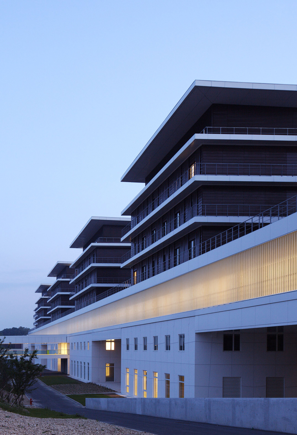
The principle adopted was based on a clear separation of functions and flows. The project’s main axis and its backbone, a strip-building 13 metres in width, represents this active boundary that clearly demarcates the front of the building (reserved for consultation and inpatient accommodation) from its back (grouping together the operational and technical facilities). Each of the entities sticks off this central axis.
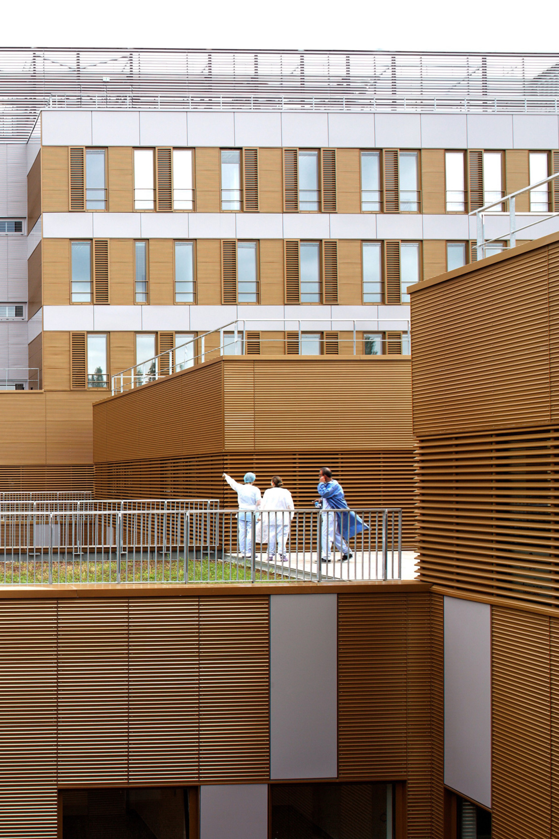
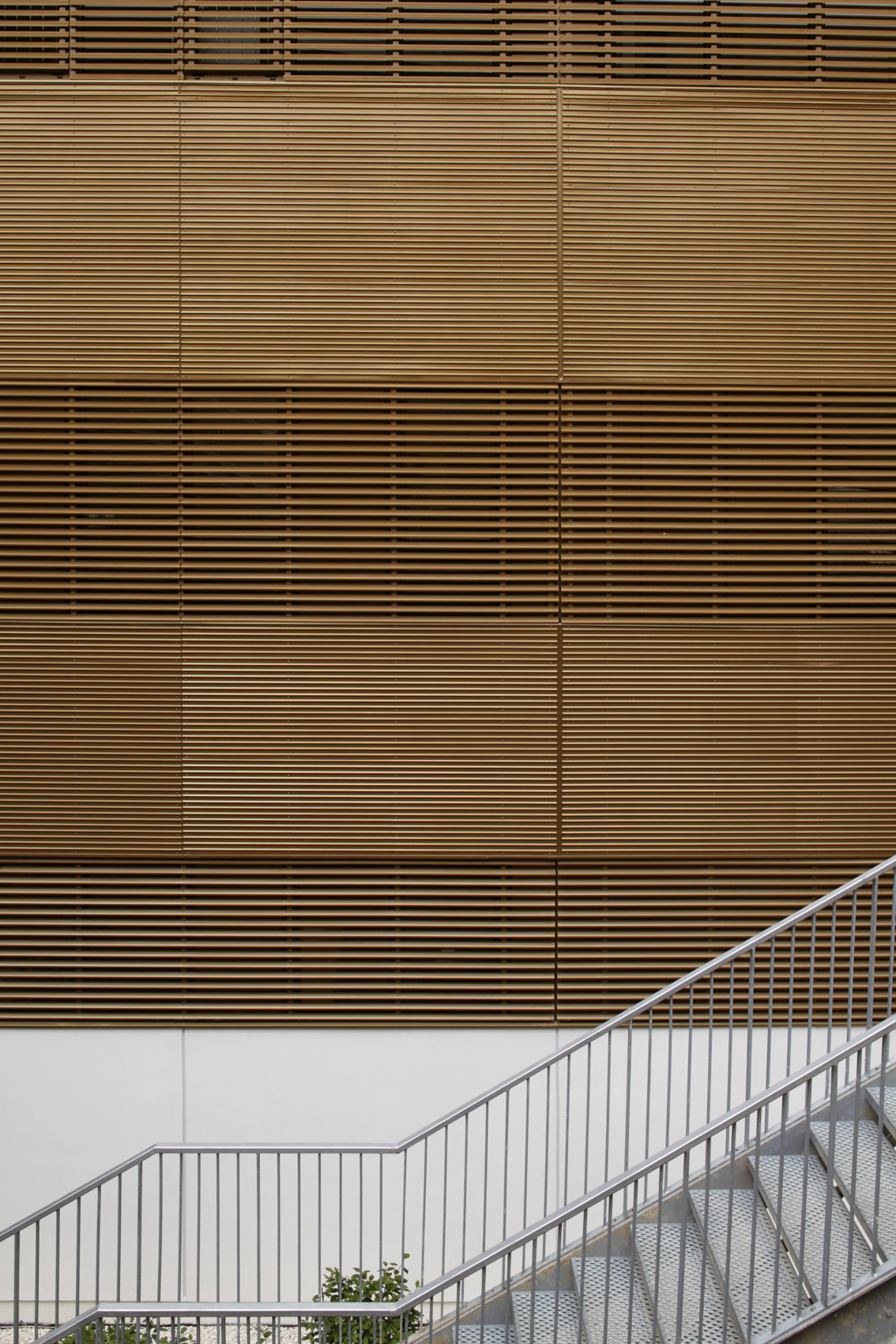
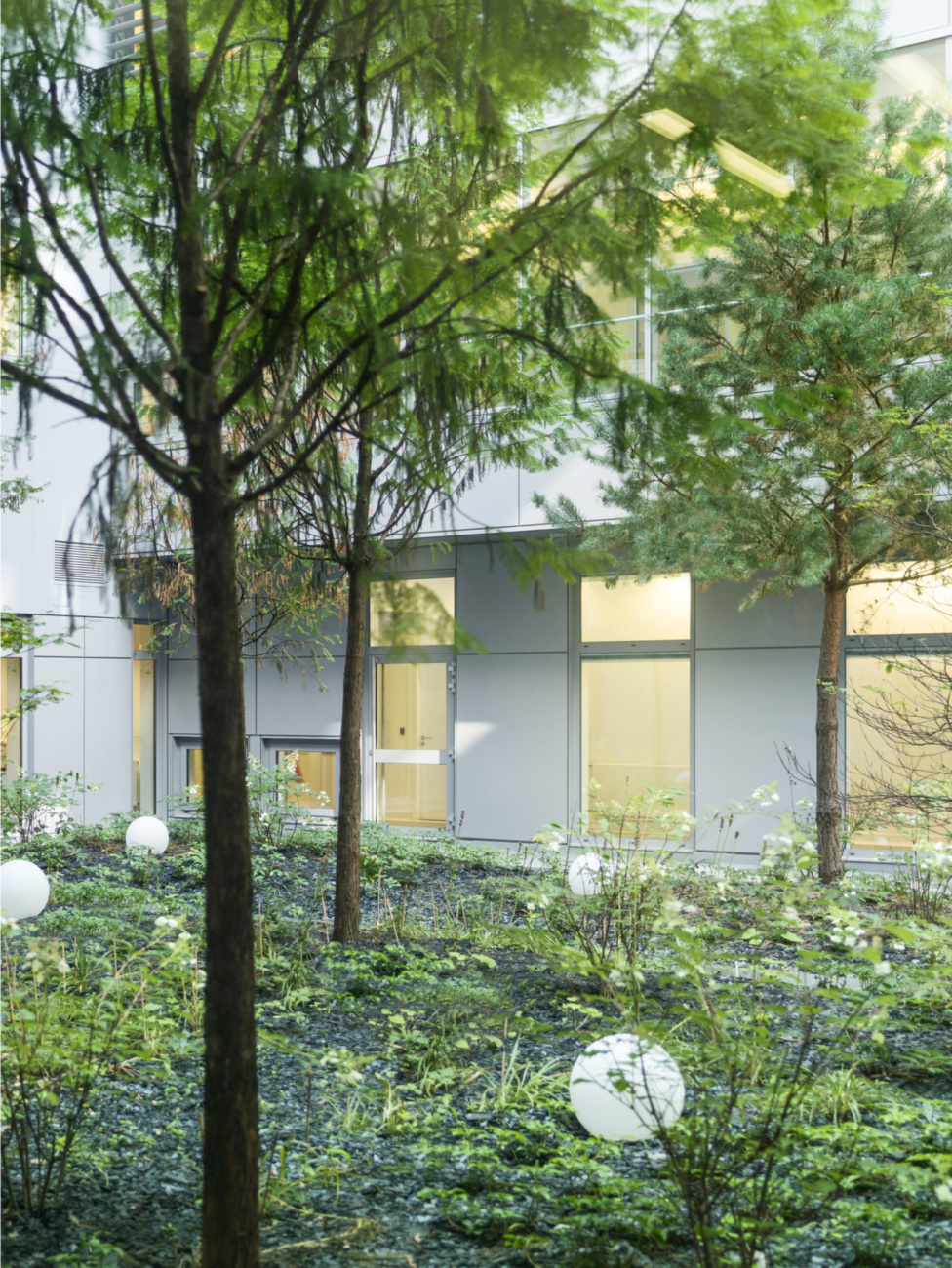
This functional partition is accompanied by an appropriate architectural expression. Rolled out like a frieze, the Consultation and Inpatient part consists of V-shaped modules hollowed out by planted patios and advancing into the park in the form of pavilions. The plinth, composed of dressed blocks with a mineral appearance, creates a protective base for the inpatient pavilions, these being designed with a light structure with wood-tone and glass panels. The architecture here serves not just therapeutic effectiveness but also the general well-being of all users, patients and caregivers. It ensures flexibility and scalability of the technical facilities, a congenial welcome, comfort and scalability of the inpatient accommodation, and clarity of flow throughout.
The hospital is thus consistent with foolproof organisation, clearly expressed. The ambition of this project is to showcase spaces, basic functions and their articulations within an overall design that strives to provide a high-performance work setting and a living environment free of drama.
